
Teams | Collaboration | Customer Service | Project Management

Microsoft Teams Health Dashboard

In this dashboard tutorial video, we will walk you through building a Teams Health Dashboard by combining the collected metrics for CloudReady Synthetics and Service Watch Desktop. The Teams Health Dashboard provides users with a holistic view of Microsoft Teams availability and performance. When an issue occurs, users can quickly review the Teams Health Dashboard and identify whether the issue is limited to an office or affecting Microsoft Teams as a whole.

Email Health Dashboard

In this dashboard tutorial video, we’ll be walking you through building a Microsoft Exchange and Outlook dashboard utilizing CloudReady Synthetics and Service Watch Desktop. This dashboard is a great first stop when diagnosing user email issues. When an issue comes up, engineers can quickly review the CloudReady data available in the dashboard to identify if an office or Exchange Online is experiencing issues or an outage.

Actionable Alarms Dashboard

In this dashboard tutorial video, we will walk you through building an Actionable Alarms dashboard. This dashboard provides users with the visibility they need into the status of their SaaS solutions as well as how their end-user devices are performing. Dashboards allow combining both CloudReady and Service Watch data into a single pane of glass for visibility. Utilizing the Alarm widgets, users can quickly identify what issues need to be investigated while quickly being able to access the affected resources for review.

6 data visualization tips to bring your data to life

Would you rather look at a spreadsheet that has hundreds of rows of raw data? Or a simple and intuitive chart that pulls out and summarizes the key insights? For most people, the answer is a no-brainer: They’ll take the chart over the eye-glazing spreadsheet any day. That’s the power of data visualization.

Introducing the Craft.io Progress Dashboard

At Craft.io, our mission has always been to give product teams and leaders the tools they need to make the best-informed decisions for their products’ success. And as a product professional yourself, you know that one of the most valuable tools available to any product team is visibility. That’s why, for example, we created Craft.io’s capacity planning and product portfolio management tools.

Enhance Your Product Portfolio Management with the Craft.io Progress Dashboard

In our post announcing the Craft.io progress dashboard, we pointed out that this new tool makes it easy for product managers to visually analyze their progress on virtually any product-related metrics and categories: quarters, sprints, products, teams, objectives, etc. Users can also filter this data in any way they choose for even deeper insights – for example, to review how consistently a specific team has completed its tasks on time over several quarters.

Choosing Sales Dashboard Software: A Practical Guide

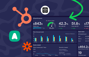
Any Sales Director worth their salt knows you need to be on top of your numbers. And if you want your sales team to be successful, you need them to be on top of their numbers too. For many, the single best way of achieving this is with a sales dashboard. A sales dashboard gives you and your team a single view of your most important metrics – so you can access them at a glance.

Build Dashboards for Monitoring the Remote Workforce

Remote workforce management is driving the business landscape, requiring cloud-based tools for monitoring to maintain productivity and user satisfaction. Real-User Monitoring (RUM) and synthetic transaction monitoring are powerful tools that enable organizations to diagnose and fix network issues faster for their employees wherever they work.

3 Ways to Set Up Real-time Analytics for your Business

If you work in a fast-paced business, it’s not hard to see why real-time analytics might be valuable. Being able to analyze live (or near-live) data can help you and your team react faster, and make more informed decisions in the moment. Setting up analytics and reporting systems always has the potential to cause a headache – this is especially true when it comes to working with real-time data.