Time for your latest dose of #data news with Nick Smith! An app from Accurat and the Google News Initiative lets you see people hopes through augmented reality. What’s the environmental cost of China’s growing economy?
Time for your latest dose of data news with Nick Smith! How much of the Earth's biomass do us humans make up? (hint: MUCH less than you think...) What happens when non-native species of animal are introduced to new environments?
In this week’s video, we discover what the world’s deadliest diseases are, whether the under-25s are drinking less alcohol and whether ‘good’ means the same to Britons and Americans.
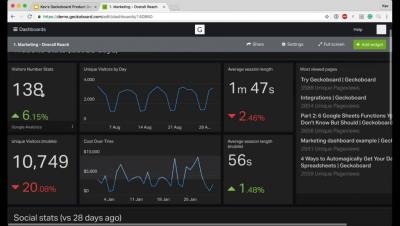
TV dashboards from Geckoboard ensure your most important metrics and current targets are clear and visible throughout the day, enabling teams to quickly identify issues, see the impact of work in real-time and keep on track to hit goals.
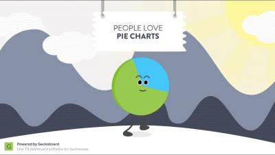
People love pie charts but there are more effective ways to visualize information. We created this short video to help you tell a more effective story with your data visualizations.
Having a great-looking dashboard is an important part of keeping everyone on your team engaged with their metrics, especially when your dashboard is displayed prominently on a TV in your office.
Geckoboard is the quickest way to create beautiful dashboards and get an instant overview of your data. In this video we run you through the the main features of the app while we create a Google Analytics widget.